IntSights
As the leading designer, I guided the redesign of IntSights' alerts center to enhance efficiency and user-friendliness. This transformation aimed at better serving our key users, including analysts and CISOs, by offering an optimized experience in managing security alerts.
Client:
IntSights (A Rapid7 Company)
My Role:
Senior Product Designer
Year:
2018-2019
Service Provided:
Product Design
Collaborators:
Yuval Inchi, Boaz Ben-Chaim
Challenges
Users grapple with alert management because of Poor Discoverability, finding it hard to locate and differentiate alerts efficiently. This is made worse by Inaccessible Information, where crucial data remains buried and hard to retrieve. Further complicating matters is a Lack of Remediation Visibility, making it difficult to track and assess the status of security alerts, thereby influencing security decisions and cost implications.
Process
I worked in tandem with internal stakeholders, valuing their feedback as I developed new wireframes targeted at better usability and efficient workflows.
Using the groundwork set by earlier designers, I introduced high-level designs, ensuring alignment with IntSights' objectives despite major shifts in product strategy and leadership.
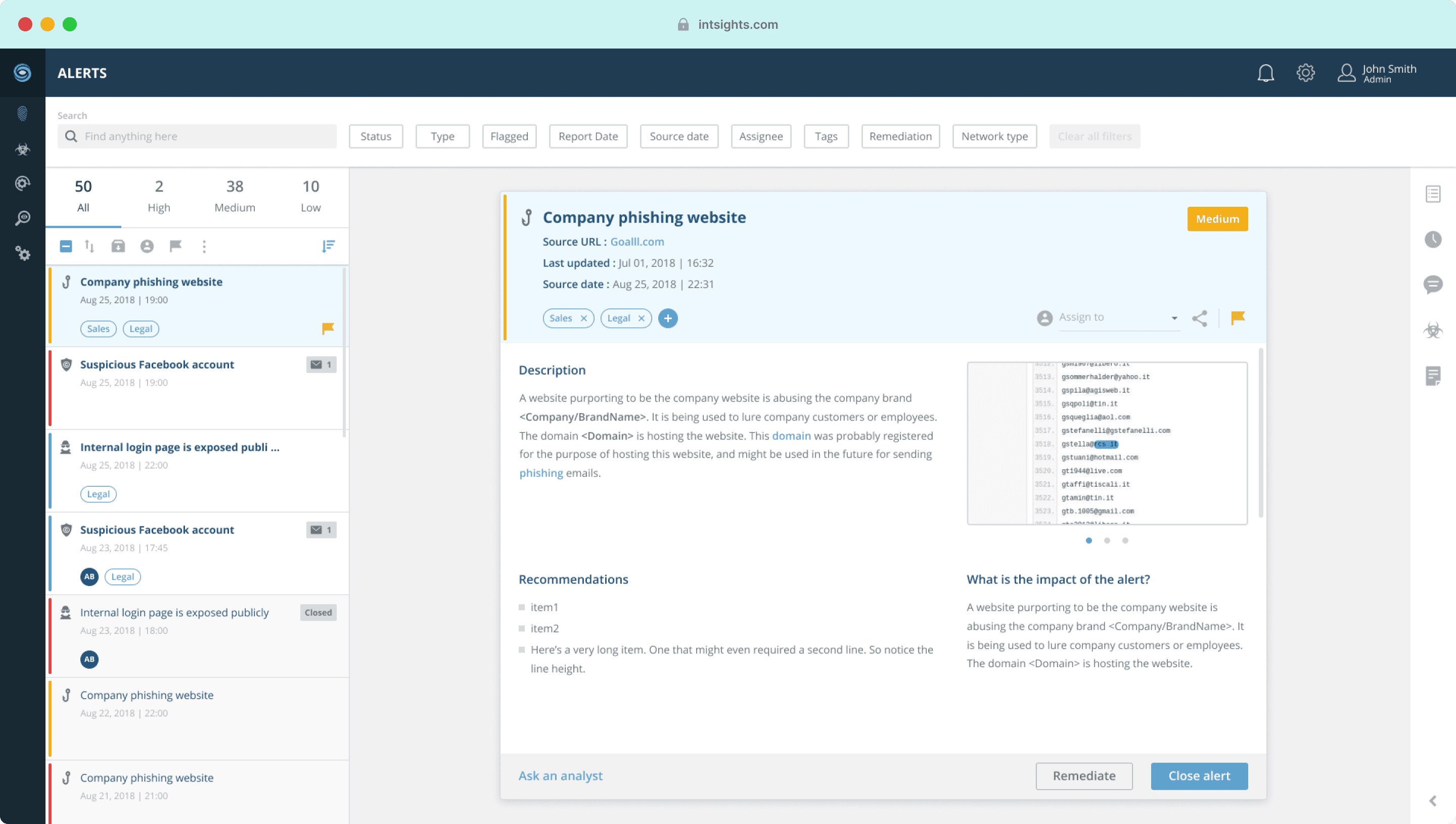
Viewing an alert in the inbox an it's details in the side bar
Solution
We enhanced the alerts center to meet evolving customer needs and improve user collaboration. Internally, we introduced a new collaborative approach across departments using the alerts center as a pilot. We achieved this by:
Emphasizing the search function, introducing severity counters to give users instant insight into alert urgency while retaining a familiar page layout.
Broadening filtering options, allowing users to pinpoint alerts by diverse criteria, enhancing the workflow.
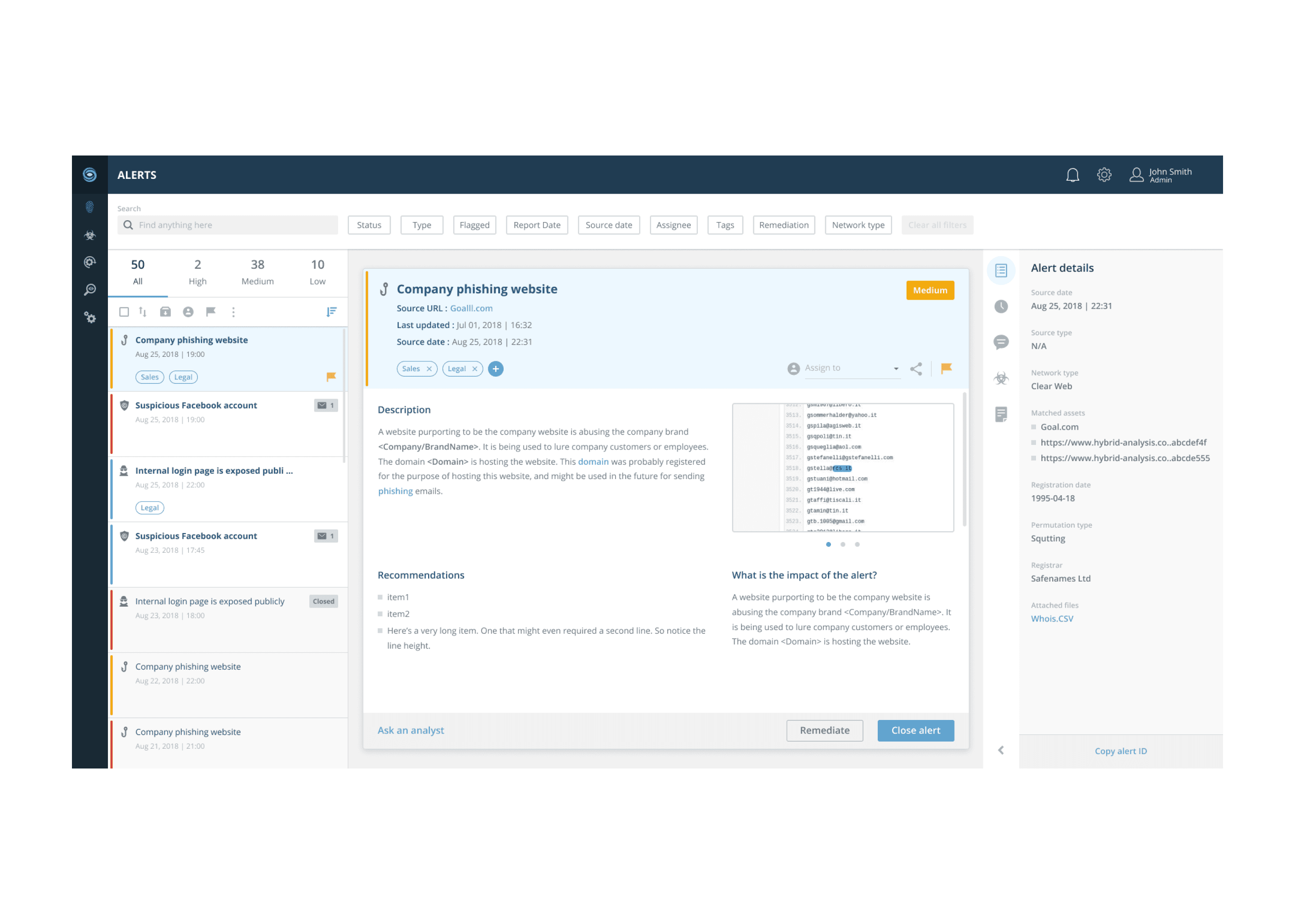
Introducing an expandable sidebar for essential details, creating a one-stop hub for critical information.
Adding an update icon to the alerts list, a clear remediation status to the alert details, and a dedicated remediation filter, greatly enhancing remediation management.
I collaborated with QA and product teams to standardize visual bug documentation, reclaiming design team ownership of the visual QA process. Efforts to improve and integrate components into the design system enhanced its quality and scope.
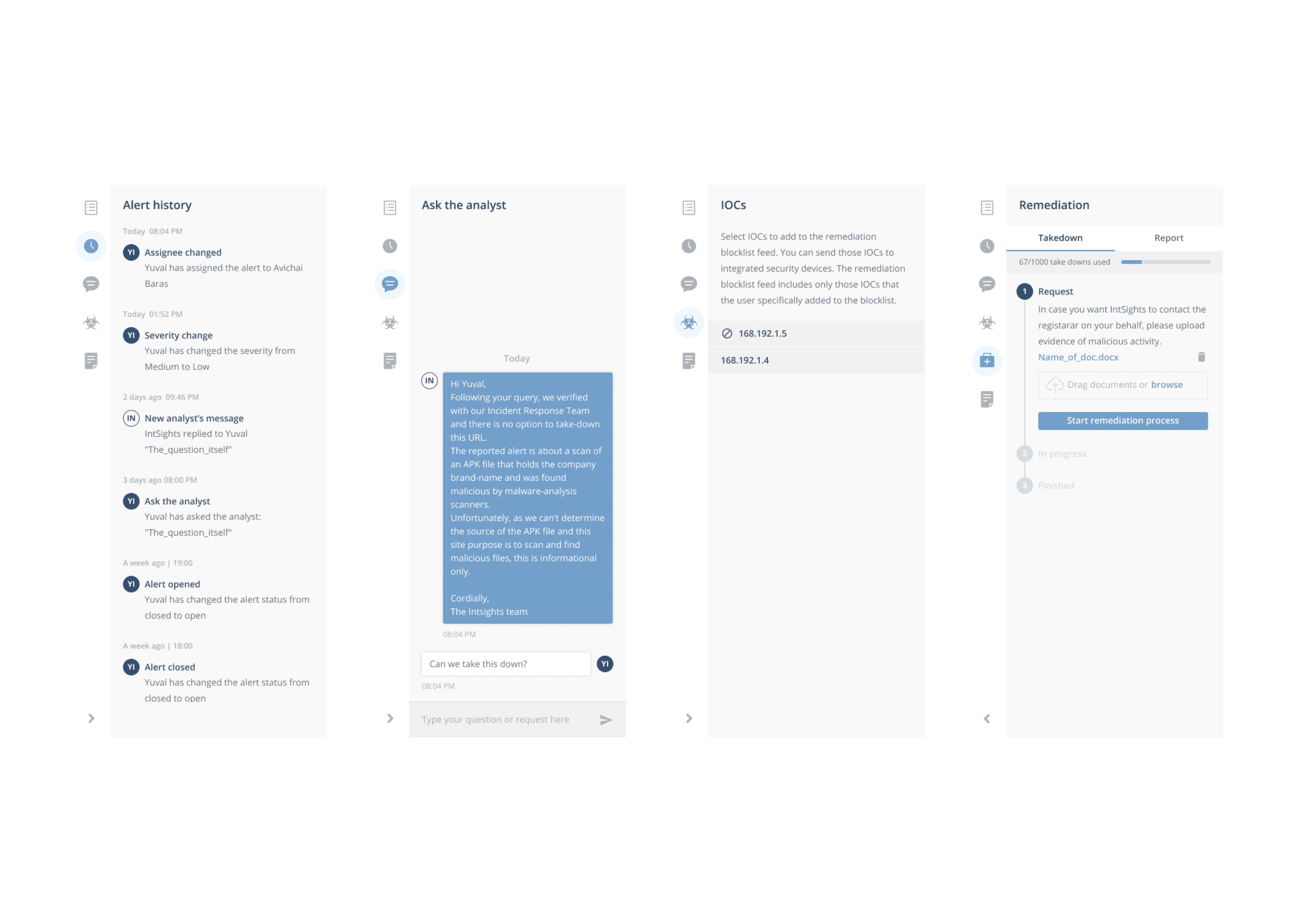
The different tabs in the alert side bar
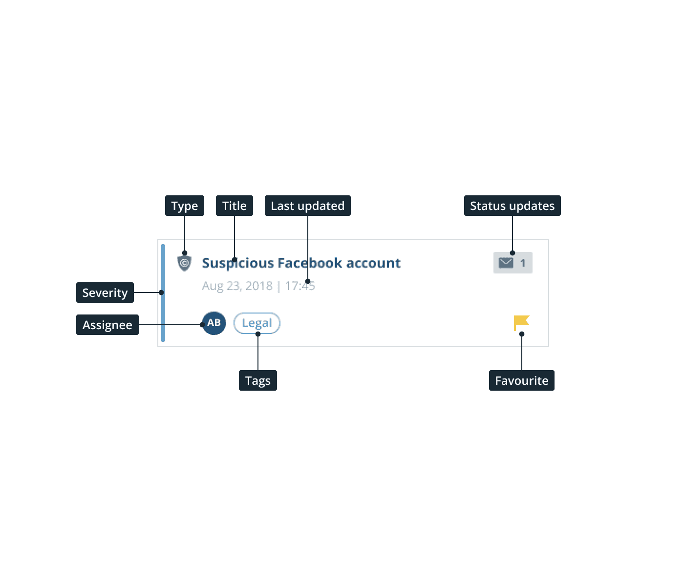
Detail: The anatomy of an alert in the alert list
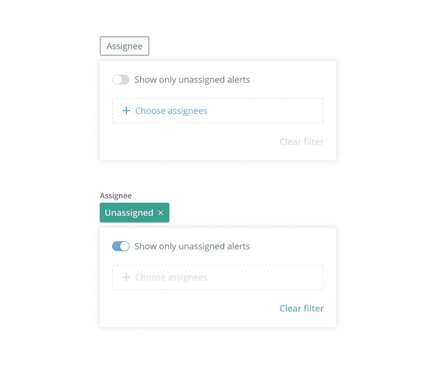
Detail: Filter in empty and full states

Remediation view for an alert
Outcome
Enhanced User Experience: Users praised the revamped navigation, better alert organization, and clearer information, boosting overall satisfaction.
Operational Gains: Analysts highlighted increased productivity, faster response times, and more efficient collaboration in handling alerts.
Efficient Remediation Management: The redesigned alerts center facilitates quicker actions with clear status indicators for security risks.
Visual Improvements: The design team’s initiatives led to the resolution of visual challenges, enhancing the platform’s aesthetics and user experience.
Side bar interaction pattern in smaller screens
Conclusion
The revamped alerts center not only improved the user experience but also streamlined security alert management. This redesign underlines the essential role of design in strengthening IntSights' position in the cybersecurity sector.
