BeamUp
We developed a POC security design tool for one of the Tech Giants, replacing outsourcing. Our goal was to ensure full compliance with facility rule books using user-generated security designs powered by BeamUP's algorithm.
Client:
BeamUp
My Role:
Head of Product Design
Year:
2020-2022
Service Provided:
Design Leadership, Product Managment
Collaborators:
Peleg Kremer, Misha Sharhorodskyi
Challenges
Outsourcing security design to an external firm presented several challenges for our project managers at the Tech Giant. Relying on Excel and PDFs to oversee security for 32 facilities simultaneously led to issues like duplicate files and confusion about versioning.
The Tech Giant’s rulebooks frequently contained contradictions as they were sourced from various places, leading to errors and delays. The CAD software in use lacked flexibility, making change management difficult and increasing the risk of equipment list errors. Moreover, the lack of a real-time centralized platform hindered collaboration.
Process
As a product manager, I worked with stakeholders and users to understand security design processes and alternatives. I coordinated with the development team for task prioritization and solutions. In collaboration with the algorithm team, we refined BeamUP's existing algorithm, crucial for our solution.
As an individual contributor, I made a prototype and interface sketches that aligned our teams and users.
As a design manager, I expanded initial designs into full features and contributed to BeamUP's design system for consistency and efficiency.
Prototype: Creating zones by assigning security levels to clusters of adjacent rooms
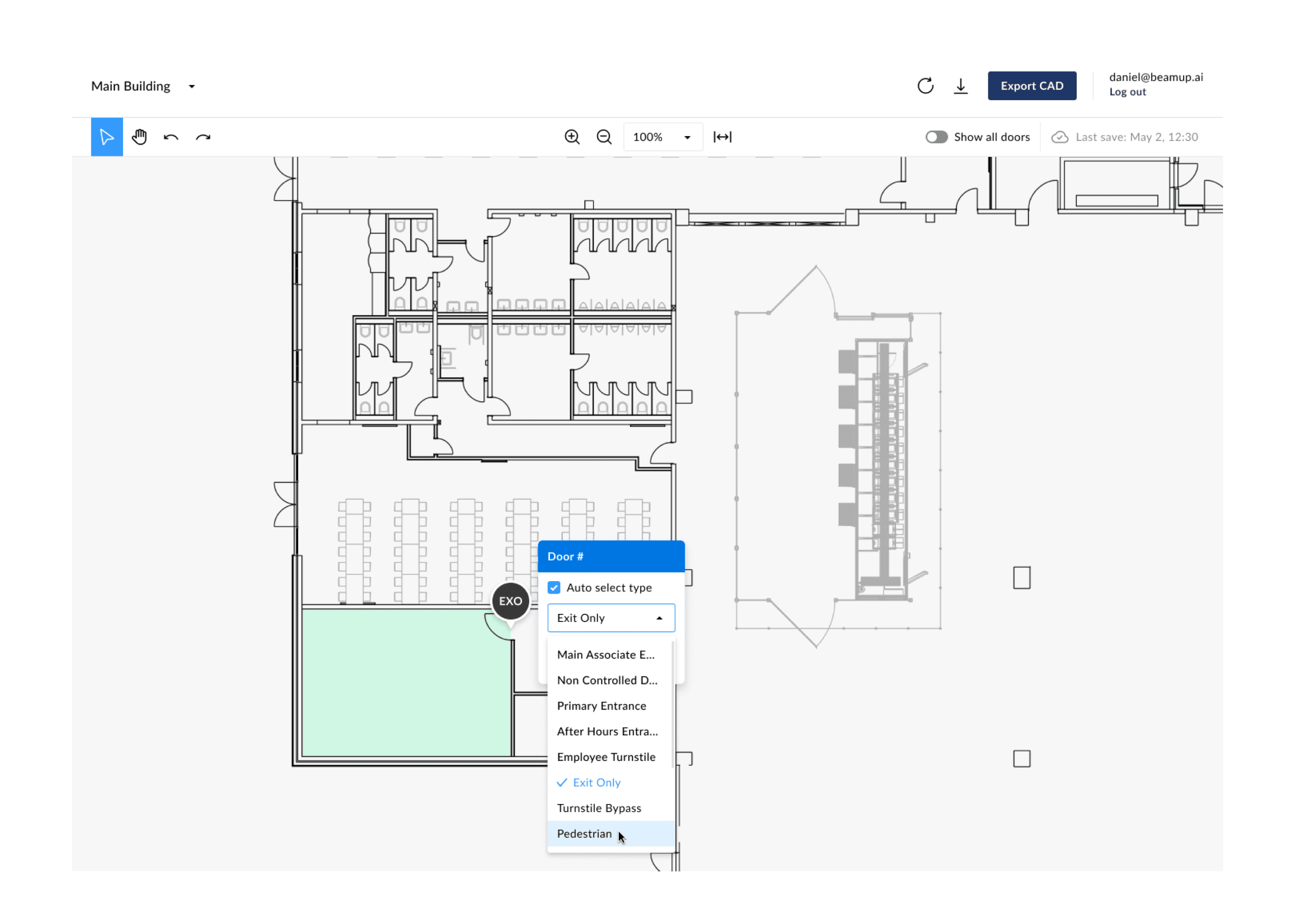
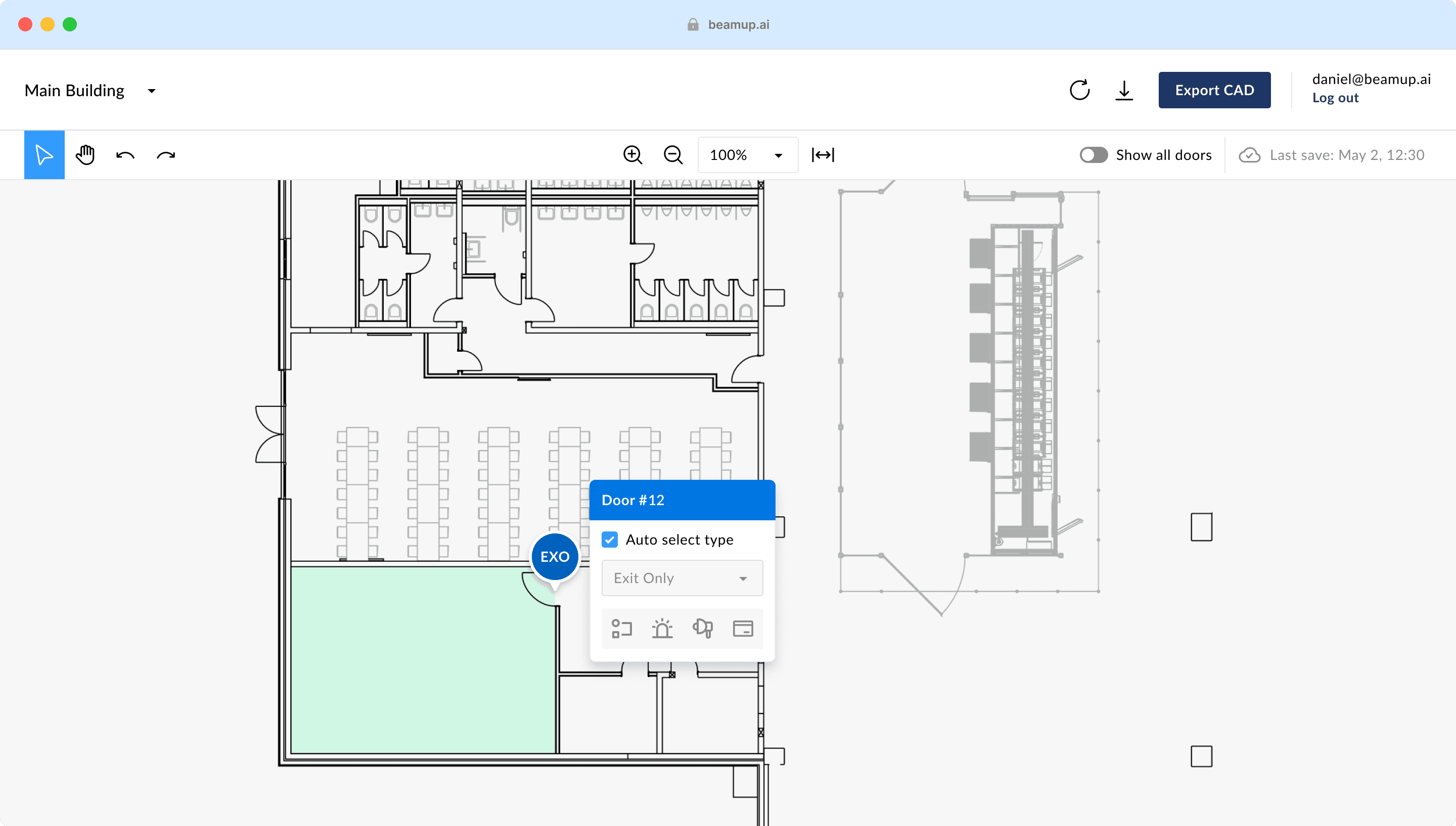
Editing the type a door in a zone
Solution
Addressing the shortcomings of CAD and BIM, we crafted an intuitive interface reminiscent of tools like Figma and harnessed BeamUP's algorithm for a dynamic, compliance-centric design approach. We achieved this by:
Refining the workflow for users to upload, analyze, generate, and export designs.
Introducing visual cues for zones, security levels, and doors, along with navigation tools for a better user experience.
Creating a floating information UI element, essential for updating room, door, and zone information.
Allowing users to recognize and address issues through clear error states in the UI, ensuring a comprehensive design process.
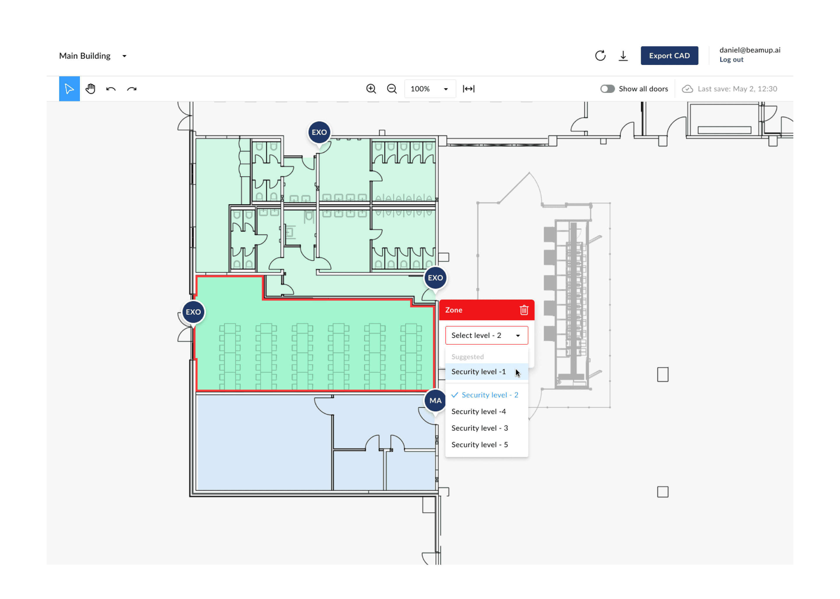
Fixing a zone by selecting a suggested security level
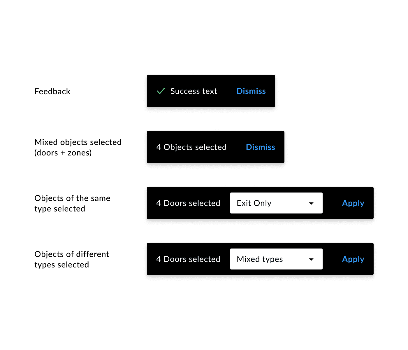
Detail: Bulk editing objects using toasts
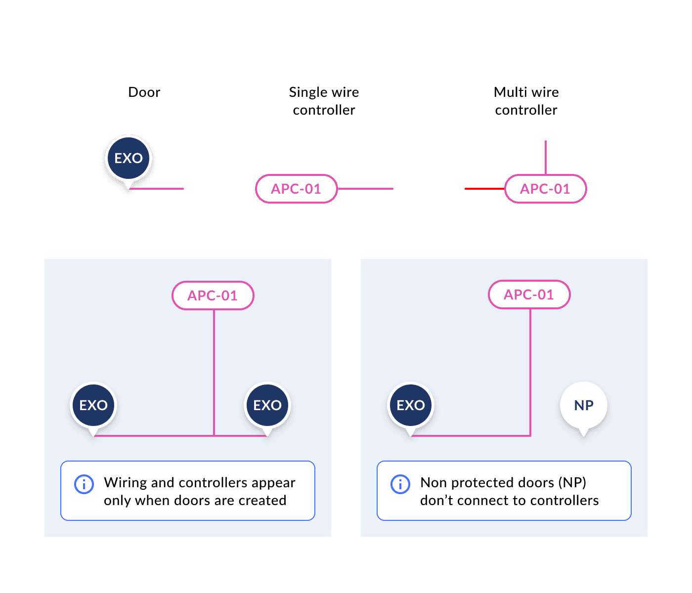
Detail: Highlight from the wiring documentation
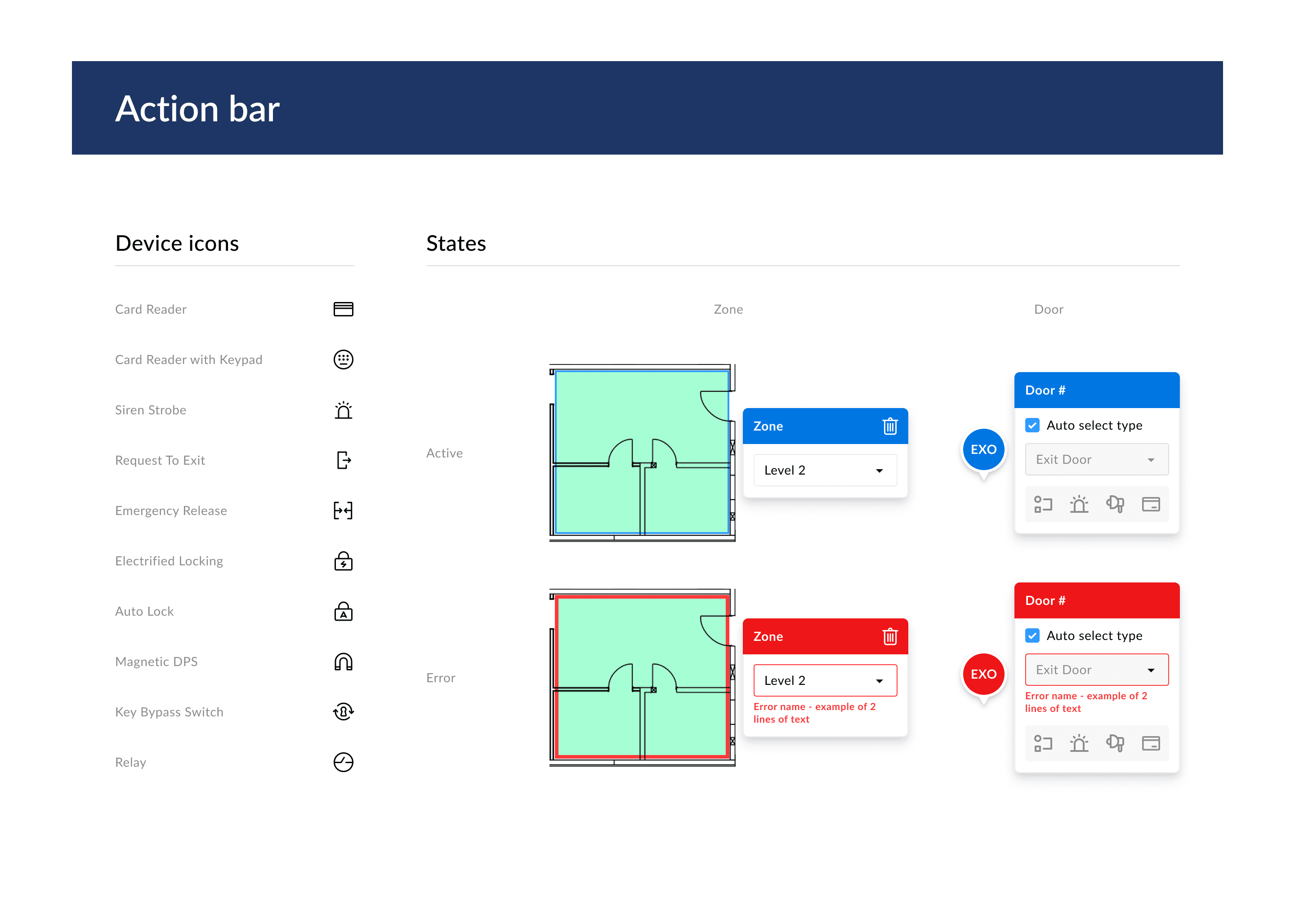
Design system excerpt highlighting icons for devices and some of the states of the action bar
Outcome
Intuitive User Experience: Users were able to navigate the system effortlessly, eliminating the need for additional training sessions.
Reduced design times substantially: Our algorithm reduced facility design time from a month to 3-5 minutes, saving significant time and costs.
Exceeded Compliance Targets: Our algorithm achieved a 95% compliance rate, surpassing the initial 80% goal.
Valued Customer Acquisition: Our success attracted the Tech Giant as a customer, with plans to transition many of their facilities to our system.
Transformational Discussions: Our unified compliance rulebooks initiated major company discussions for the Tech Giant.
Further Exploration
After the project's success, I explored the relationship between the door indicator, the floating information element, and room devices. This stemmed from user feedback on the cleaner floor plan and interactive elements. Recognizing the widespread use of single line diagrams (SLD) in system design, we leveraged SLD for a new door indicator. This approach enhances the user experience by capitalizing on existing knowledge, our algorithm, and interactivity.
Prototype: Exploring the door indicator using a backend graph for visualizing single line diagrams
Conclusion
The BeamUP security design tool not only improved the user experience but also expedited the design process, ensuring cost savings. This project also allowed us to enhance BeamUP's design system, improving collaboration between design and development teams, and further supporting BeamUP's advancements.
